When it comes to improving local economies and communities, adequate safe and affordable housing is one of several factors that help attract employers and jobs to a place. But with so many data sources and tools to visualize data, where should city, county, and regional planning agencies; community development corporations; housing non-profits; and other key stakeholders begin?
When assessing community needs, thinking local is critical to success. Costs and affordability need to be considered to ensure homeownership and rental housing are not out of reach of would-be residents. Some data points to consider include:
Existing home characteristics: Do they meet the needs of would-be buyers?
New home construction: Are the resources in place to support the construction of new homes?
Affordable Housing: Is there a sufficient supply of affordable housing for workers at lower income levels and those otherwise in need?
Access to jobs: Are residents able to secure employment nearby, or must they commute outside the area for jobs?
Rental properties: Are their offerings that meet the demographic needs of the community?
Transportation: What costs will residents bear from a transportation perspective?
When visualizing data associated with these questions and other concerns, there are a multitude of tools offering numerous options for presenting data. We think the best tools allow planners to illustrate points clearly, attractively, and concisely to facilitate audience understanding. Furthermore, tools must be easy to use and, given the limited financial resources of many organizations, either free or low-cost.
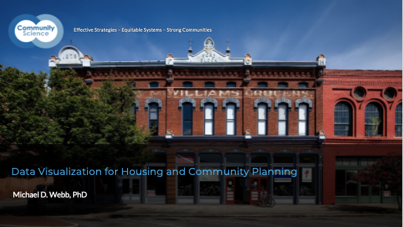
This webinar showcases several easy-to-use data sources and visualization tools to improve agencies’ community and housing planning efforts. Most of the tools showcased will be free to the public or available at reduced cost to public agencies or non-profit organizations, so they are especially useful for small or under-resourced organizations.
Examples of data sources showcased include job counts and commuting data, affordable housing developments and unit counts, historic housing count data, and housing and transportation cost data. Visualization techniques highlighted include ArcGIS storymaps, infographic software, and interactive data dashboards.
The webinar is geared toward professionals at various skill and experience levels who are working for any agencies that utilize housing or community development data in their work. We feel the topic is especially pertinent to staff who are ‘data curious’ and looking for some easy-to-use tools to get their feet wet in data analysis and visualization, as well as more experienced professionals who are looking to deepen their knowledge of data sources and visualization techniques.
Your Host
Michael Webb, PhD
Managing Associate
Community Science
Michael has wide-ranging experience in researching, evaluating, and developing affordable housing and community/economic development policies and programs across the U.S. His focus includes designing and implementing evaluations of federal, state, and local policies and programs; project management; and providing technical assistance.
At Community Science, Michael works with public sector and nonprofit clients to help them research and identify the best data resources for their situation and visualize that data to achieve their equitable housing planning & development goals.

